Portal - Dev Sprint 94
Usability and Quality of Life improvements
In this Sprint, we were focused on establishing a secure platform for configuring Middleware components, as well as creating a prototype for the new Orders page.
Features
User Management
Unable to find the Login option in Portal
We frequently got the information that (new) customers could not find the Login to Portal. Until now, if a user wanted to login/register to portal, it was not clear while navigating the main page of https://portal.fiskaltrust.de. We changed the existing button to make clear that the login / registration is happening here:

Data Exports
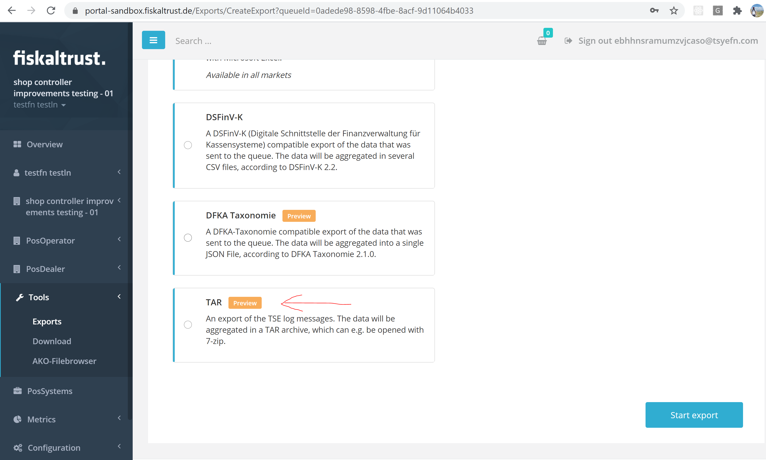
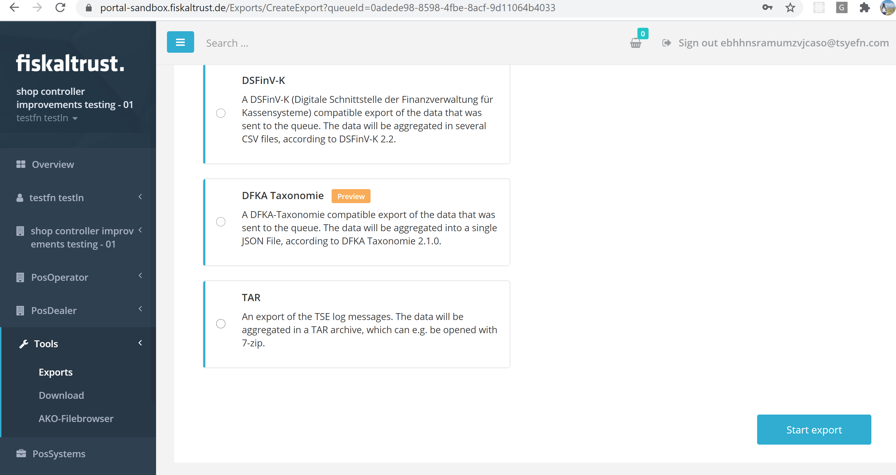
TAR file export in release state
The TAR file is finally in a state that is correctly usable and therefore we should officially release and enable it for all customers. The preview flag has been discarded, and the feature flags are cleaned.
Before:
After:
Middleware Configuration
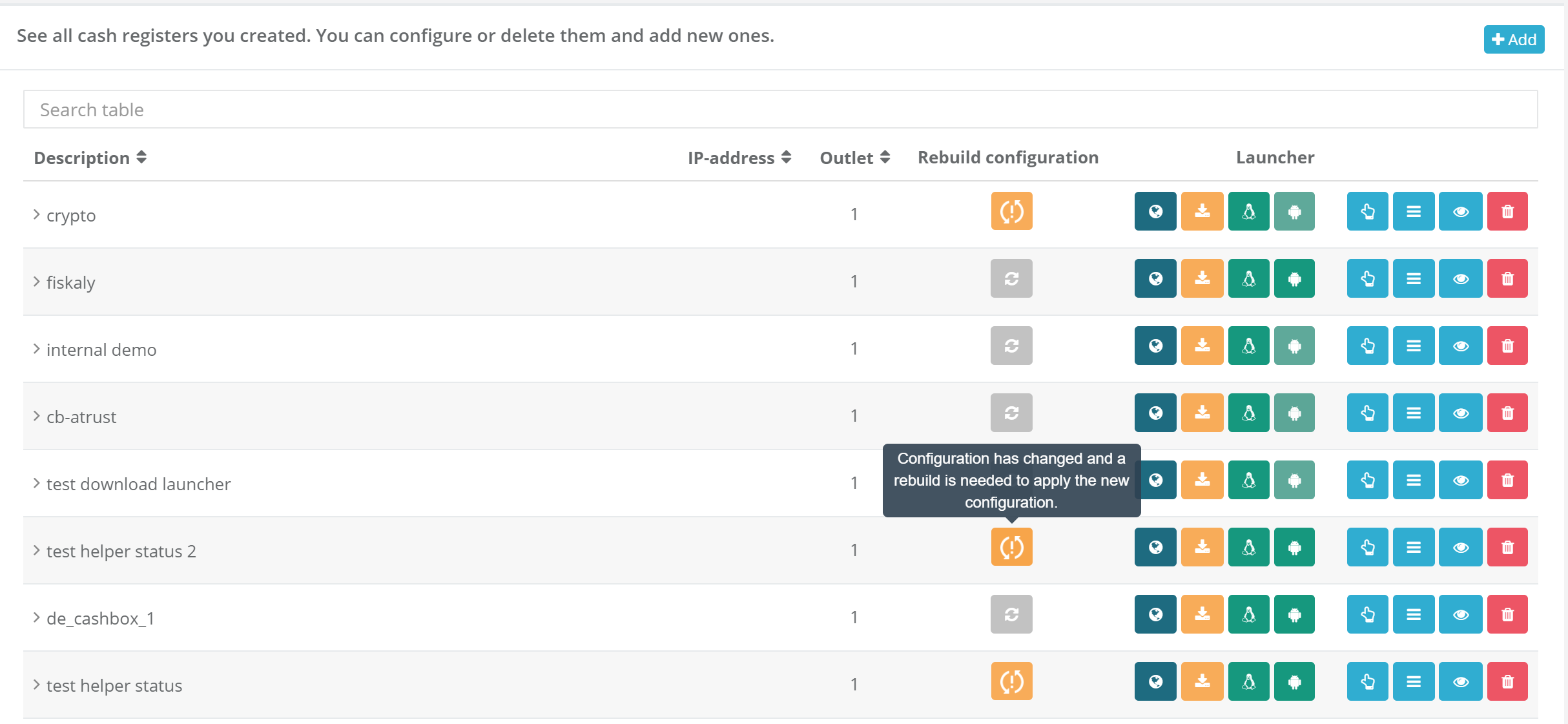
Clarify usage of CashBox State indicator
With the purpose of improving usability, the configuration change status and rebuild button have been merged into one column:
Clarify why Queues cannot be deleted
In the past we did get many questions why the delete button is not availalbe. In many cases it was not clear, why this button has been disabled. We tried to improve that by adding an extended tooltip to the delete button.

E-Commerce
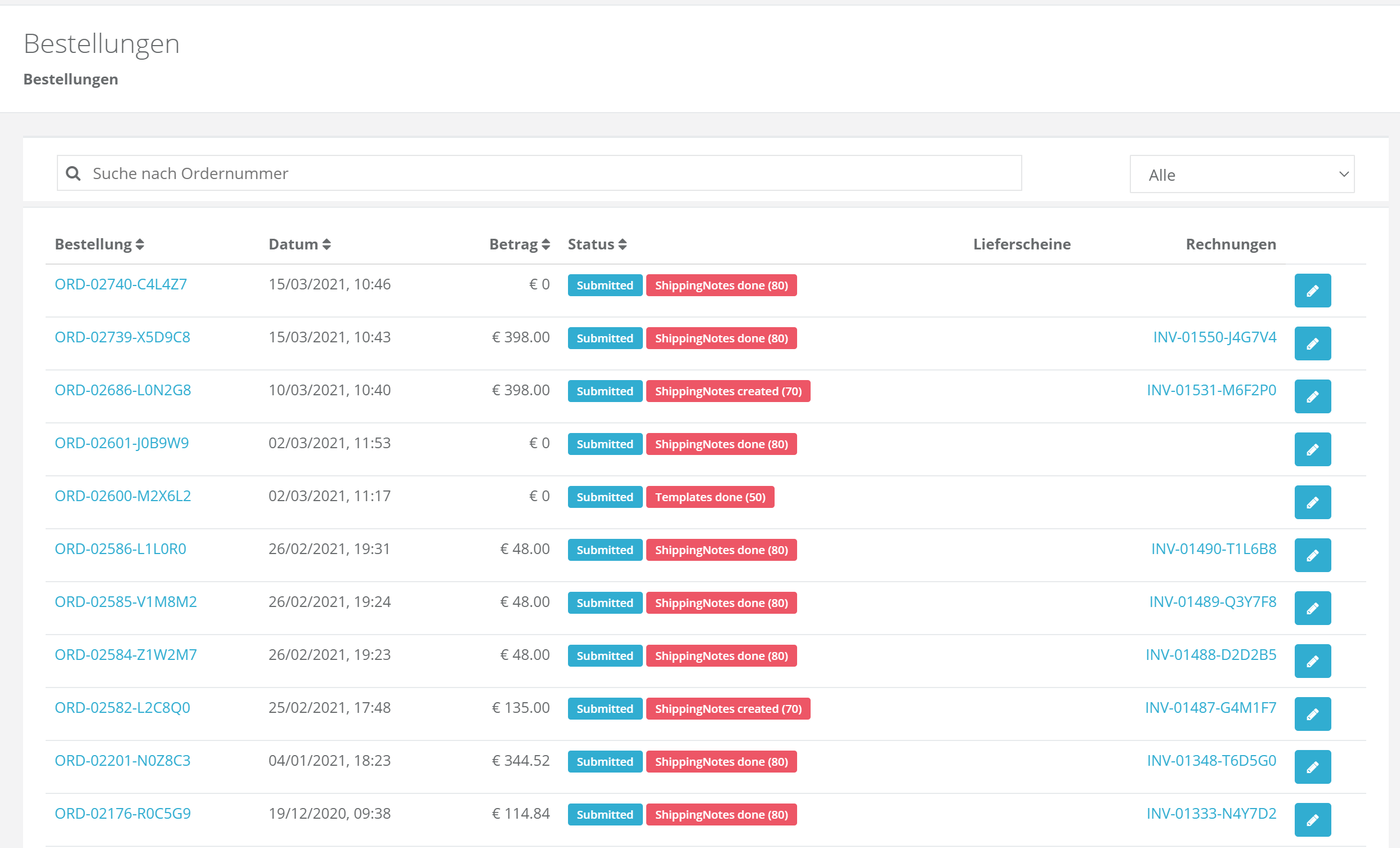
Prototype of the new Orders Page
A Prototype of the new Orders Page has been created. In the past, issues such as failed orders, long loading times of the ordering page, TSEs not received at the checkout and so on, arose very frequently. Various components of the new Orders Page have already been integrated to deal with the aforementioned issues, and more information will be shared, as more changes are implemented:
Next steps
In the next weeks we will focus on finishing the new orders experience to being able to put it into public preview.
Feedback
We would love to hear what you think about these improvements and fixes. To get in touch, please reach out to feedback+portal@fiskaltrust.cloud.