A New Navigation That Fits Your Screen

Summary
The portal has a new navigation. Every entry is where you know it, and the menu now fits the screen you work on: a full sidebar on a desktop, a slim strip of icons on a tablet, a menu that opens on demand on a phone. You can also collapse it to give the page more room, and the portal remembers that.
Why This Matters
You use the navigation on every visit, so it should never be in your way. The old sidebar was made for a desktop screen. On a tablet or in a narrow browser window it took a large share of the screen from the page you were working on. You could collapse it, but then you were left with icons without names, and the sidebar was back at full width the next time the page loaded.
The new navigation adjusts by itself. It leaves more room for the page on small screens, shows a name under every icon so you never have to guess, and stays the way you set it.
What Changed
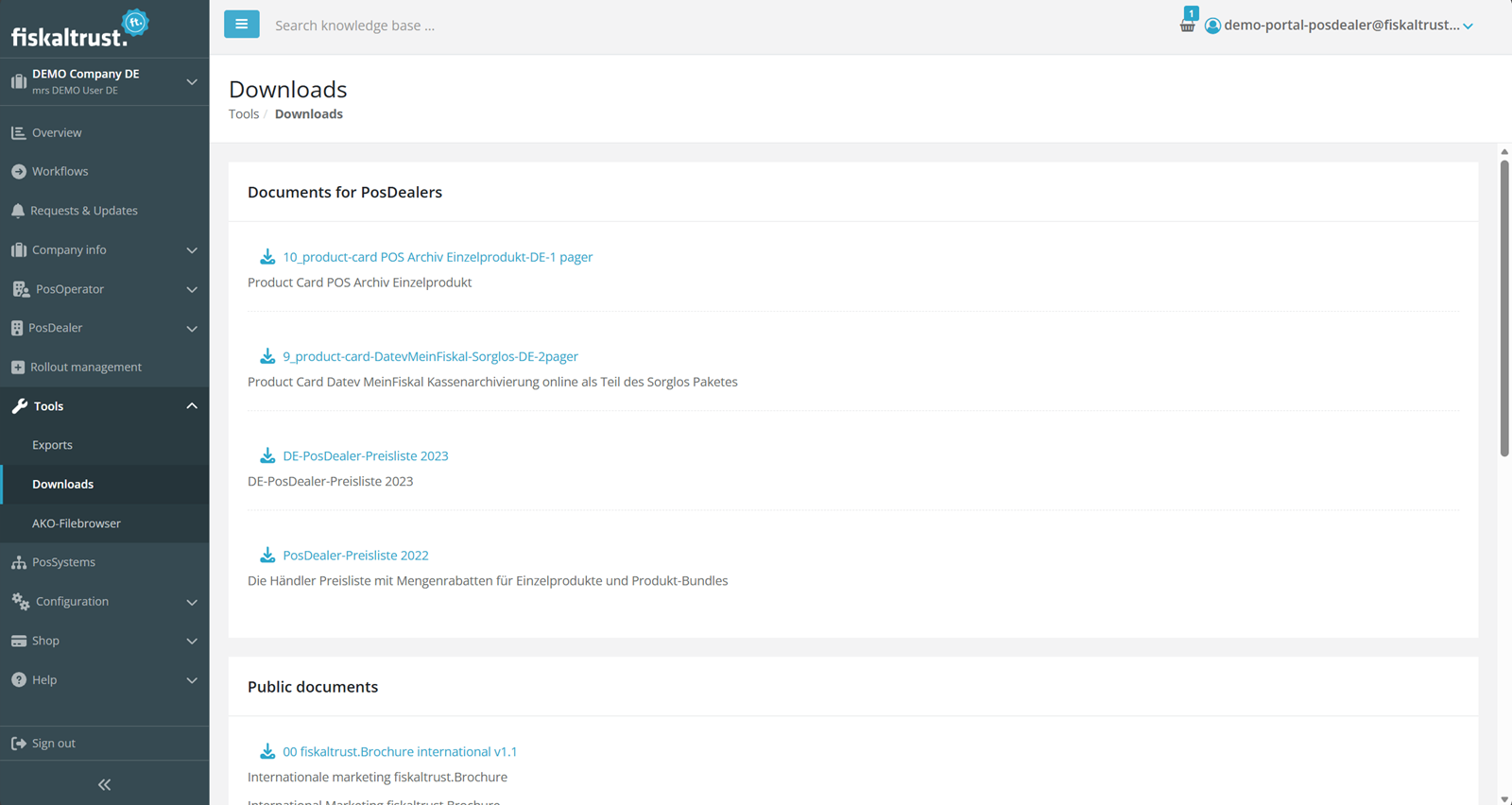
On a desktop or laptop you see the full sidebar, as in the picture above. Click a section to open its pages below it. The section of the page you are on is already open when you arrive.
On a tablet or in a narrow window the sidebar becomes a slim strip of icons, each with its name. Click a section and its pages open next to the strip.
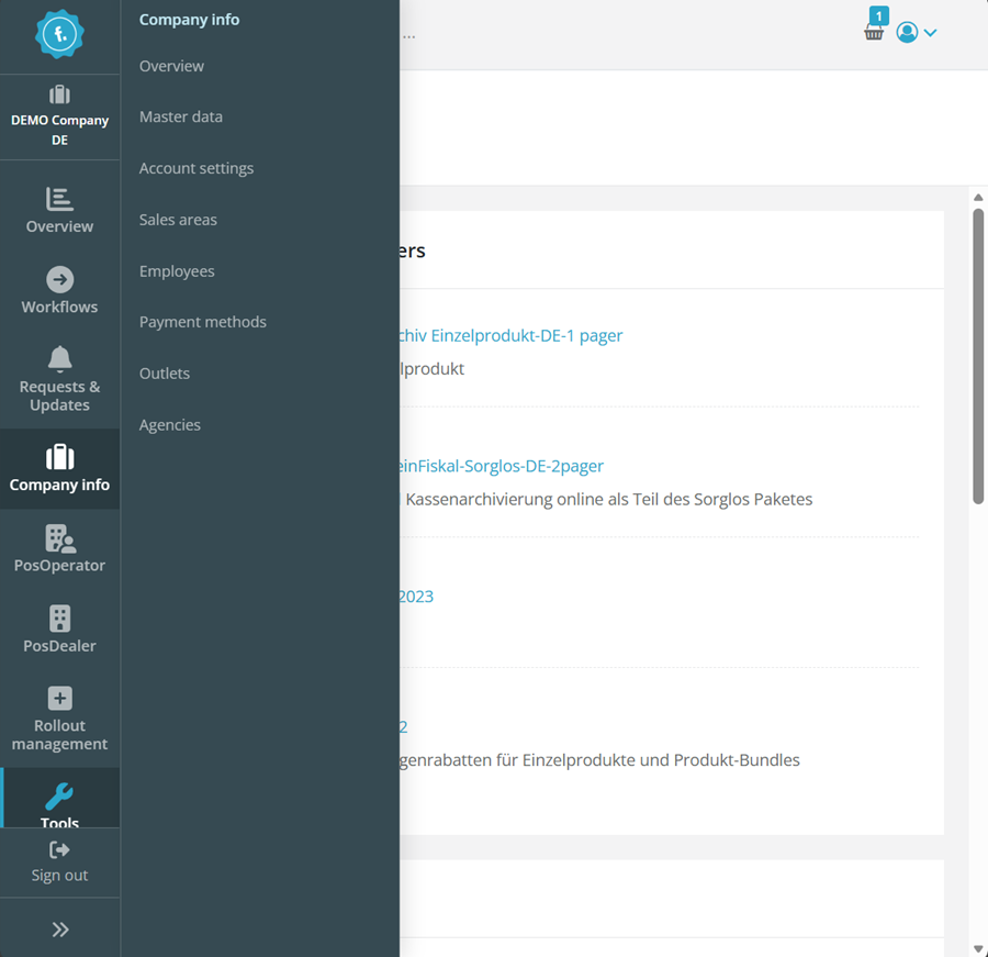
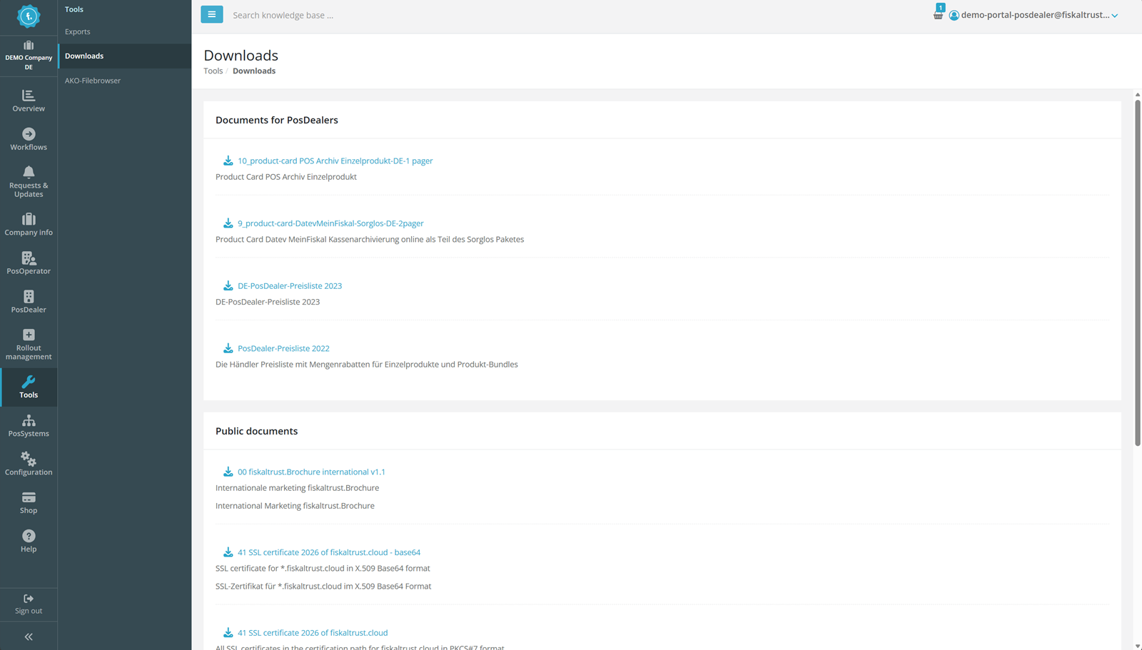
On a large monitor the strip stays, and the pages of the section you are in stay open in a column beside it.
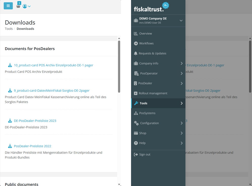
On a phone the navigation steps aside. The menu button in the top bar opens it over the page, and it closes again as soon as you pick a page.
Two more things are new:
- Collapse the sidebar whenever you like. On screens with a sidebar, the button at the bottom of the navigation and the menu button in the top bar switch between the full navigation and the icon strip. The portal remembers your choice in your browser.
- A fresh look. The navigation carries the new fiskaltrust logo and the portal's current design.
Impact
This applies to all markets and to every portal user. Nothing needs to be done on your side. Every entry keeps its name and its place, and you see the same entries as before. Page addresses are unchanged, so your bookmarks still work. Switching between your accounts under your company name and Sign out at the bottom of the navigation work as before.